v0.5.2-beta • Open Source
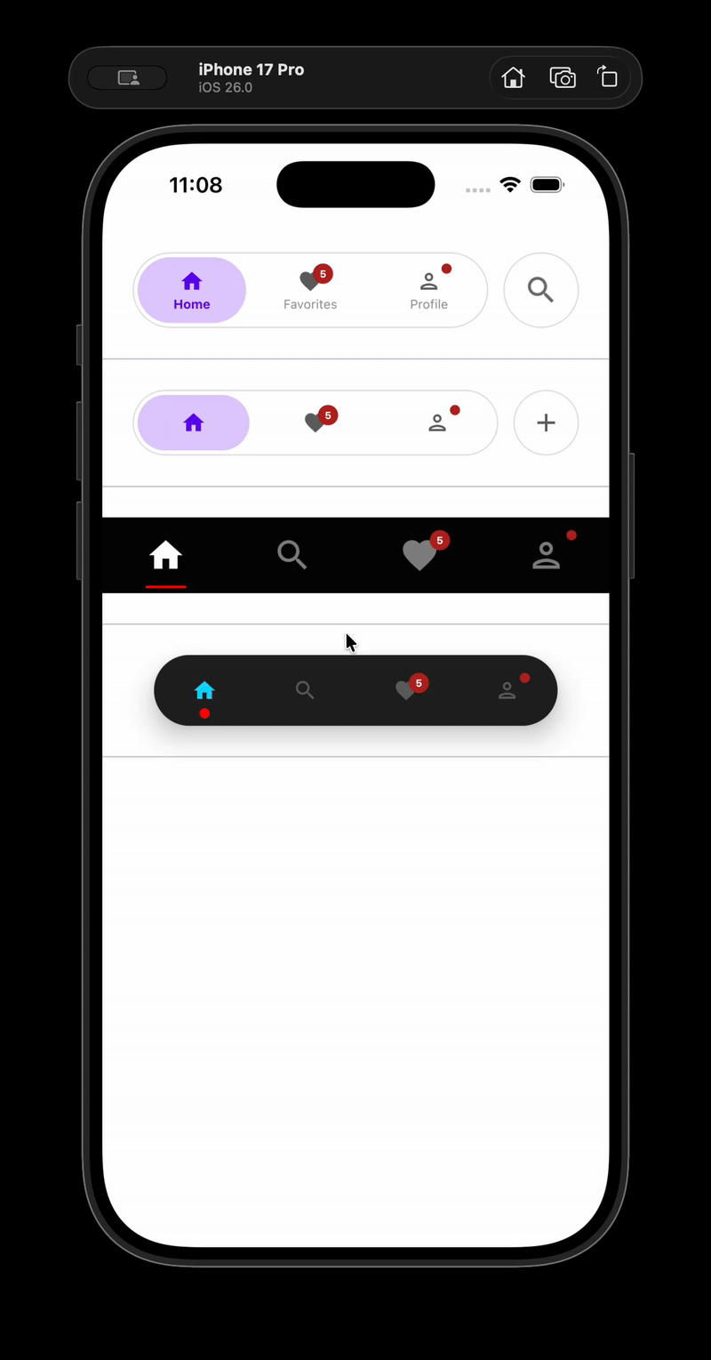
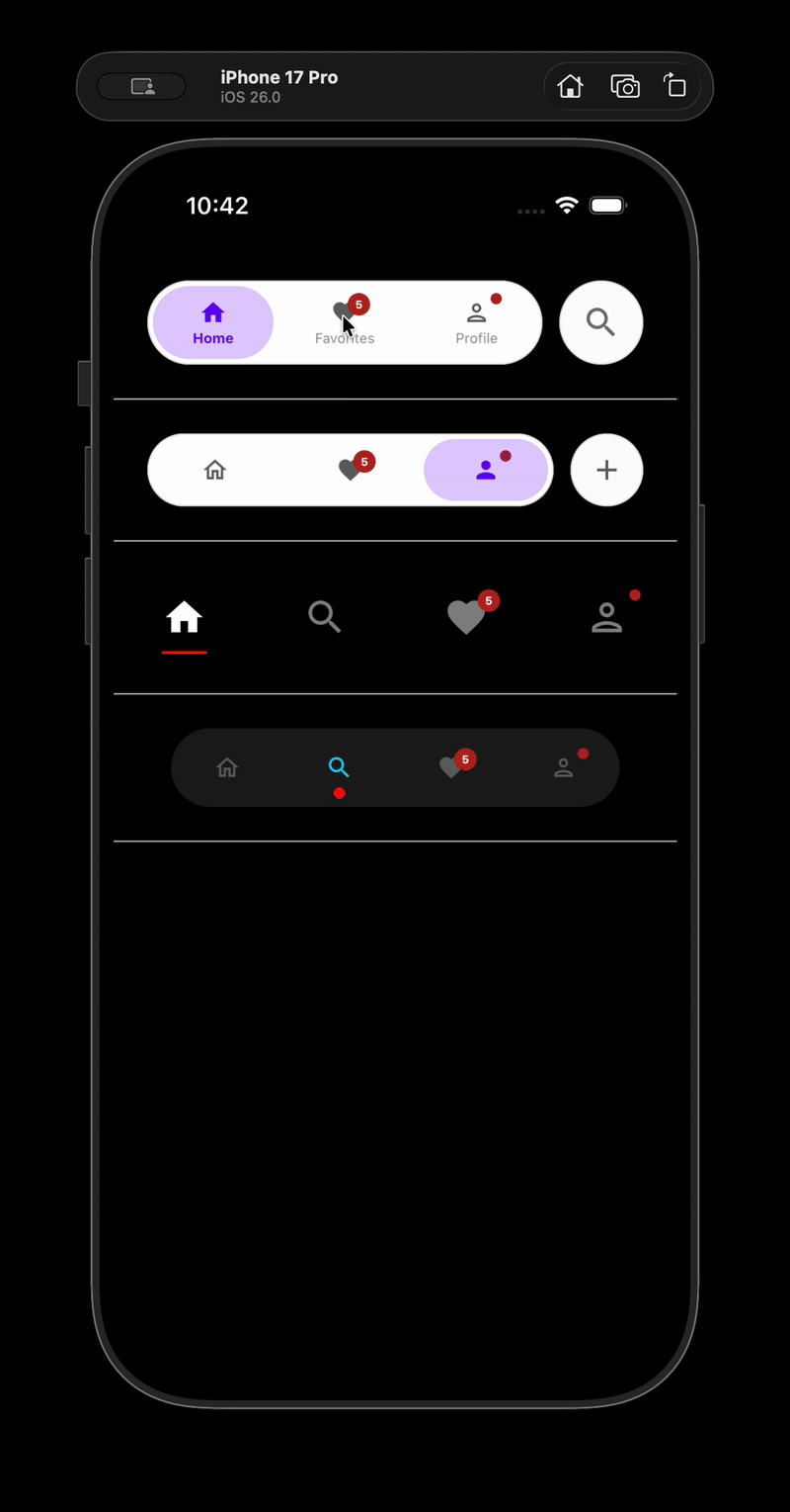
Beautiful Bottom Navigation


Beautiful Bottom Navigation
for Compose Multiplatform
Framework-agnostic, production-ready, with smooth animations and zero navigation dependencies.